Interactive Dashboards: Features, Why It Matters & Use Cases

Bold BI® empowers businesses to embed interactive dashboards, explore AI-powered analytics, and turn data into actionable insights—all within your apps.
Introduction
As organizations collect more data from CRM, marketing, support, and operational systems, teams often struggle to move beyond static reports and understand what is driving performance changes. Interactive dashboards address this challenge by allowing users to explore data, investigate trends, and answer follow-up questions without waiting for additional dashboards.
Interactive dashboards provide a dynamic layer on top of underlying datasets, enabling both technical and non-technical users to drill down, filter, sort, and explore data in real time. Instead of relying on static snapshots, stakeholders can adjust views on demand, zooming into specific regions, timeframes, or segments to understand exactly where and why changes occur. This shift empowers decision-makers to explore insights independently, making organizations more agile, responsive, and truly data-driven.
In this blog, we’ll explore what interactive dashboards are, how they differ from static dashboards, the features and business use cases that make them valuable, and how Bold BI® supports interactive analytics and dashboard experiences.
What is an interactive dashboard?
An interactive dashboard is a dynamic analytics interface that enables users to explore, analyze, and interact with data through visualizations, filters, and other interactive controls. Unlike static dashboards, interactive dashboards allow users to investigate trends, answer follow-up questions, and uncover deeper insights from a single view without requiring a new report for every question. By enabling self-service data exploration, they help business users access insights faster, improve visibility into performance, and make more informed decisions.
Understanding what an interactive dashboard is provides only part of the picture. To fully appreciate its value, it is important to see how it differs from traditional static dashboards and why many organizations are shifting toward more interactive analytics experiences.
Interactive dashboards vs. static dashboards
A static dashboard presents data in a fixed format with limited or no user interaction. You can view predefined metrics and visualizations, but to explore deeper insights, you often need to create additional dashboards. Let’s see how static dashboards differ from interactive dashboards and why interactivity has become increasingly important for modern business analytics.
Feature | Static dashboards | Interactive dashboards |
Data updates | Periodic or scheduled refresh | Real-time or near real-time updates |
User interaction | Limited or none | High (filters, drill-down, cross-filtering) |
Data exploration | Fixed view of data | Dynamic exploration of multiple data layers |
Flexibility | Rigid and predefined | Customizable and user-driven |
Decision-making speed | Slower (requires new dashboards) | Faster (instant insights) |
User dependency | High reliance on analysts/IT | Self-service for business users |
Insight depth | High-level summary only | From summary to granular analysis |
Personalization | Same view for all users | Role-based, personalized views |
Use case | Analysis and compliance | Analysis, monitoring, and decision-making |
These differences show how interactive dashboards extend beyond fixed ones by helping you explore data, investigate trends, and answer follow-up questions more efficiently.
Now, let’s explore why interactive dashboards are important for modern businesses.
Why interactive dashboards matter
Interactive dashboards are important in the following ways:
Faster decision-making with real-time insights: Dashboards help teams monitor key metrics as they change, so they can respond quickly to revenue shifts, operational issues, campaign performance changes, or customer behavior trends.
Self-service analytics with reduced dependency on analysts: Business users can answer follow-up questions independently through filters, drill-downs, and interactive controls, reducing reporting backlogs and allowing analytics teams to focus on strategic work.
Improved operational visibility: Teams can track performance across departments, processes, and KPIs from a single view, making it easier to identify bottlenecks, delays, or underperforming areas before they escalate.
Enhanced collaboration across teams: Shared dashboards give sales, marketing, support, operations, and leadership teams a consistent view of performance, helping them align faster and make decisions using the same data.
More confident, data-backed decisions: Users can explore the data behind summary metrics, validate assumptions, and understand what is driving changes before acting.
Together, these benefits help organizations move beyond static reporting and interact with data in a more meaningful way. Next, let’s explore the common features of an interactive dashboard.
6 features of an interactive dashboard
Interactive dashboards enable users to explore and analyze data dynamically through real-time interaction, making it easier to uncover insights and act faster.
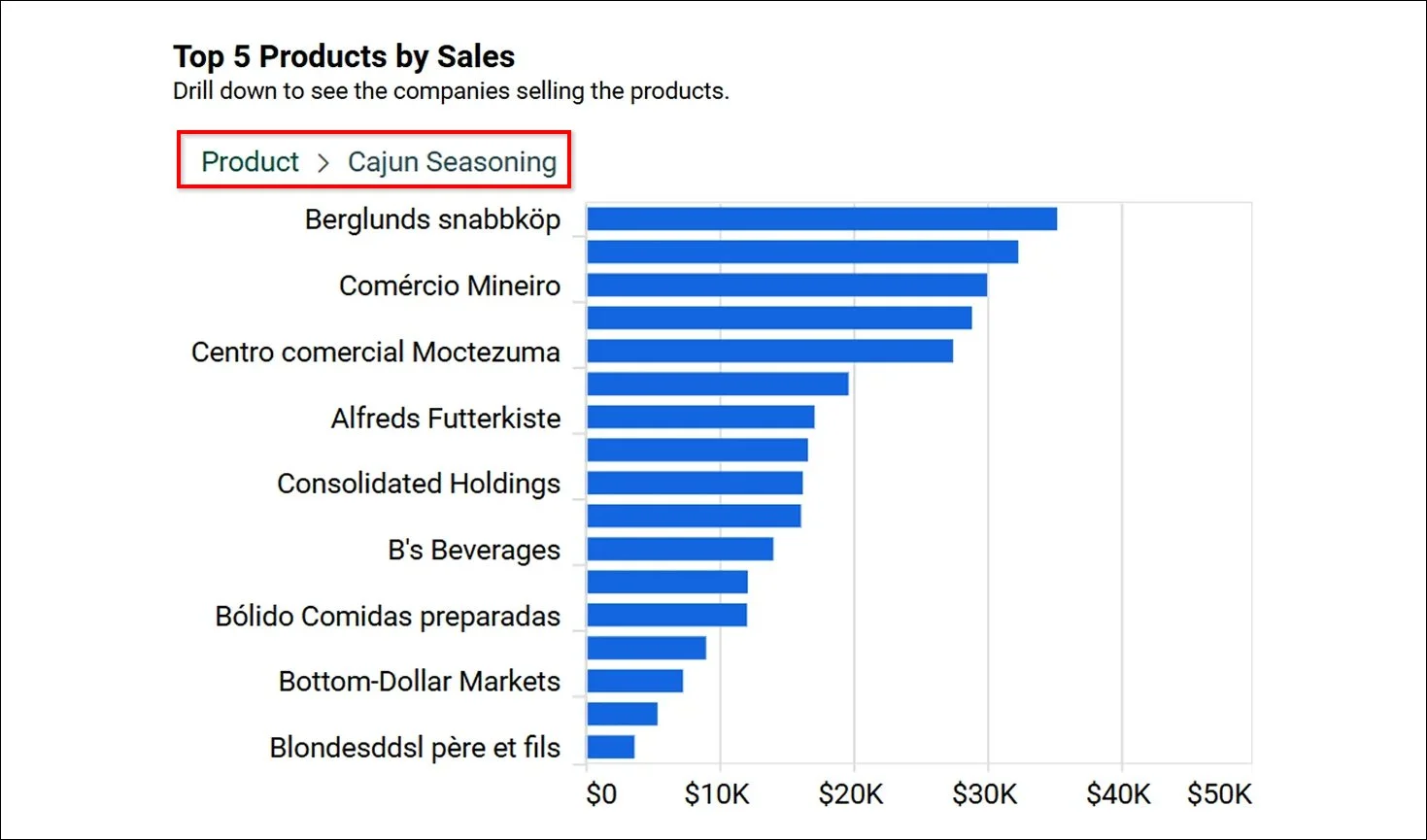
Drill Down: Users can move from high-level summaries to detailed data with a single click, enabling them to uncover patterns, analyze hierarchies, and gain deeper insights without leaving the dashboard.
Drill Down
Filtering: Users can refine datasets in real time, focus on relevant segments, and explore multiple perspectives within the same dashboard for more targeted analysis.
Filtering
Linking: Users can navigate between related dashboards while preserving context, allowing continuous exploration and a more comprehensive understanding of data relationships.
Show or Hide Values: Users can toggle specific data points on or off to simplify visuals, highlight key comparisons, and focus on the most important insights.
Hide or Show
Sorting: Users can reorder data dynamically to identify trends, compare performance, and spot outliers more effectively in a structured format.
Sorting
Drill up: Users can seamlessly navigate from detailed data back to higher-level summaries with a single click, allowing them to view aggregated insights, compare broader trends, and maintain context without leaving the dashboard.
Drill up feature
These are just a few examples. To enhance your understanding of all features you can use in your dashboard, refer to our Bold BI blog on “5 Interactive Data Visualization Features to Know.”
Now that we’ve explored the key features, let’s see how interactive dashboards are applied across different business scenarios.
Use cases of interactive dashboards
Interactive dashboards adapt to different roles and industries by surfacing relevant insights at the points where decisions are made.
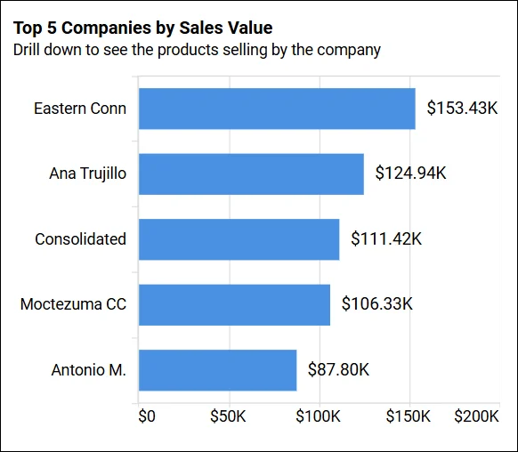
Sales performance analysis
Sales teams need visibility into how performance varies by region, product, or sales stage. The Sales analysis dashboard allows managers to filter sales data by product or territory and drill into trends, regional performance, customer channels, and company‑level sales.
Managers can identify declining regions, compare product performance, and respond to sales trends before they affect revenue targets.
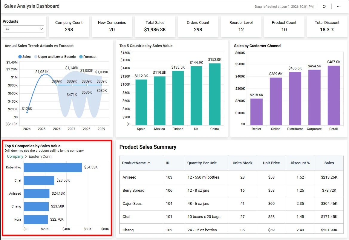
Sales Analysis Dashboard
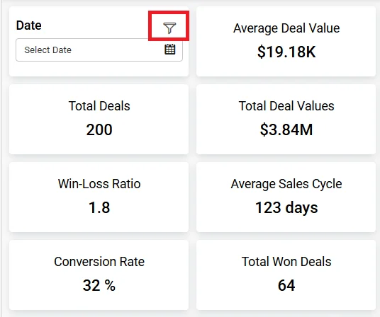
Marketing campaign optimization
Marketing teams often need visibility into email campaign performance over a selected period. The ActiveCampaign Email Marketing Performance Dashboard provides insights based on a filtered date range, allowing focused analysis of recent activity. This allows teams to identify underperforming campaigns earlier, optimize marketing spend, and improve campaign ROI and identify high-performing campaigns faster.
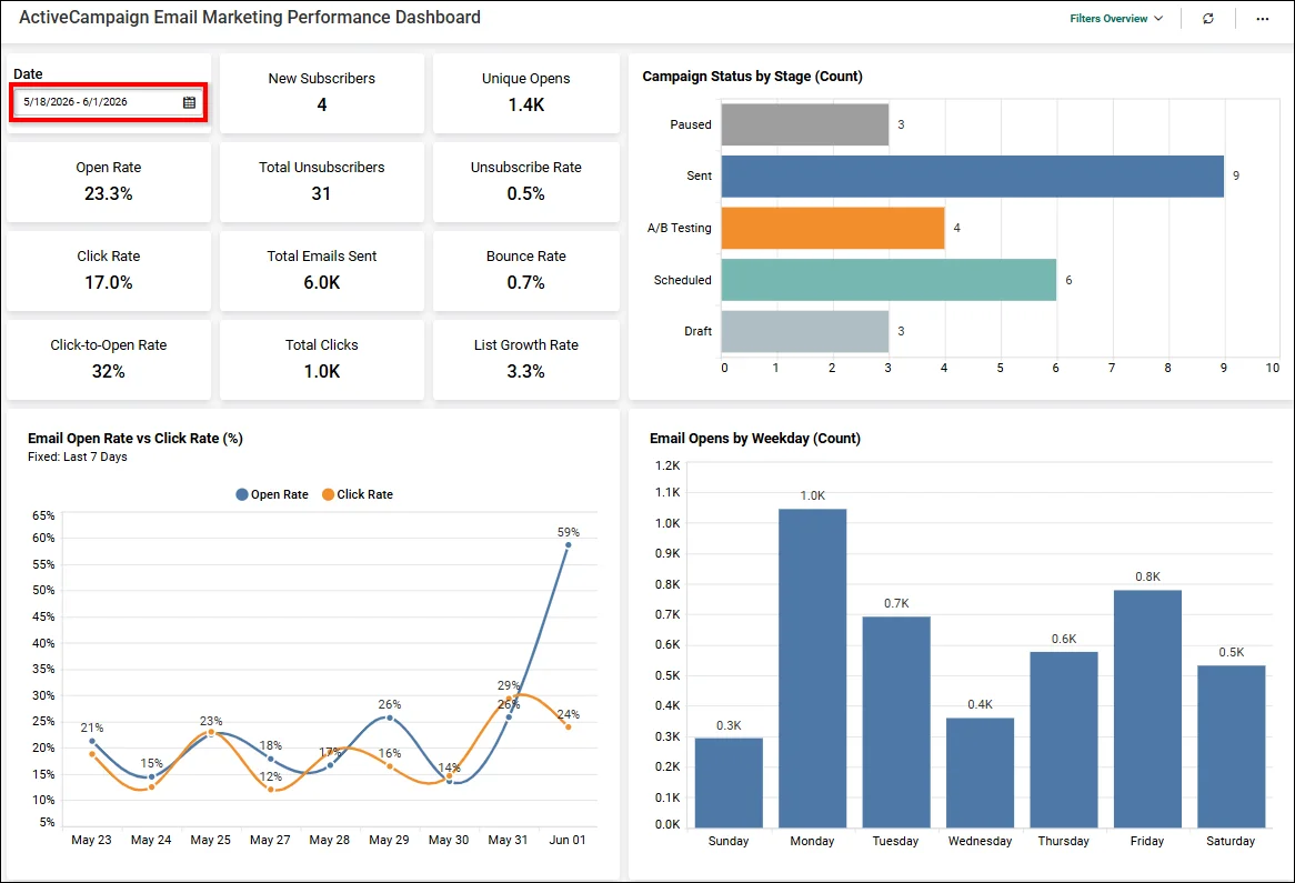
ActiveCampaign Email Marketing Performance Dashboard
Customer support and operations monitoring
Support teams must quickly identify why ticket volumes increase, which issues affect customer satisfaction, and where response delays occur. The Call Center Agent Performance Dashboard allows teams to drill down into agent ticket data and performance metrics by individual agents, including call volumes, handling time, adherence, efficiency, and quality scores.
By exploring support data interactively, teams can identify operational bottlenecks earlier, compare agent performance, and improve overall service responsiveness.
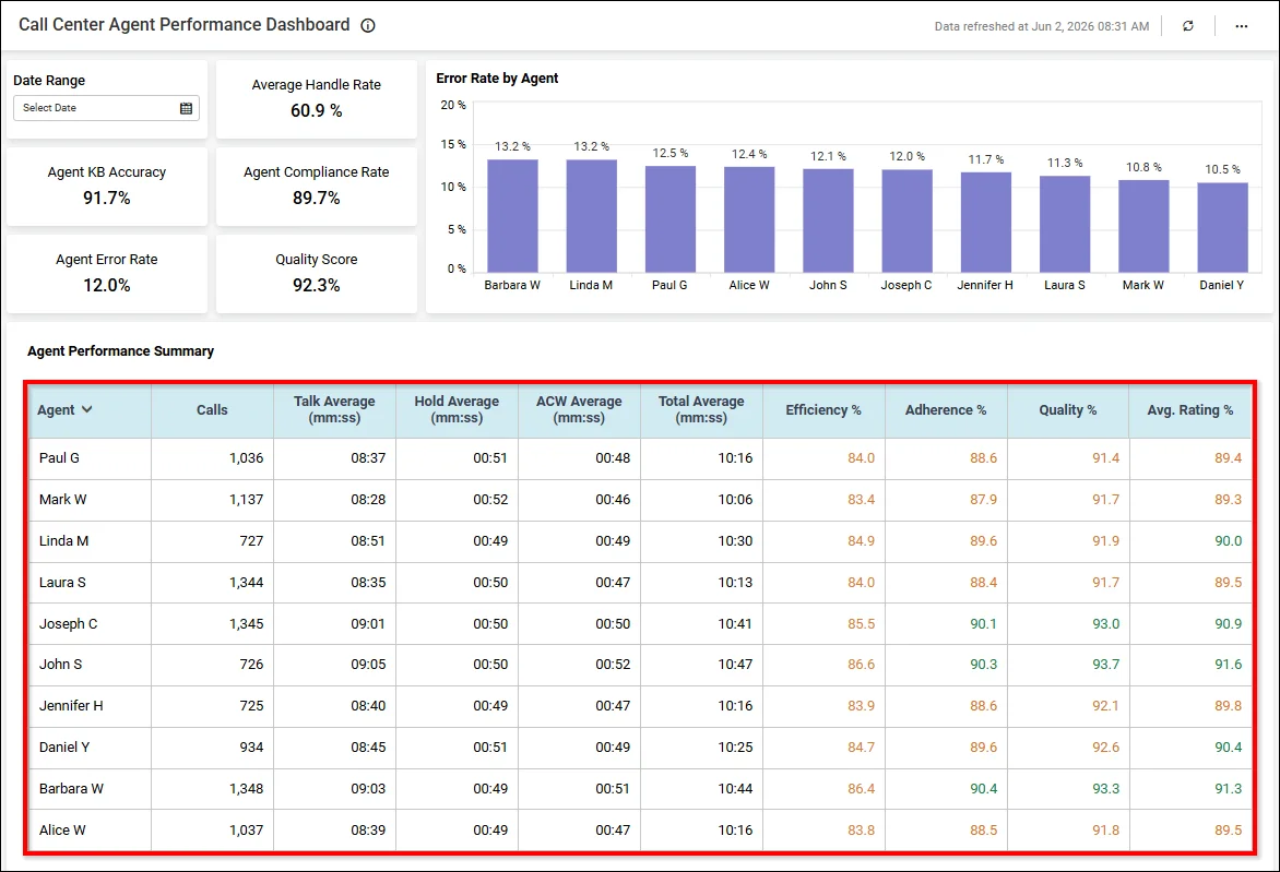
Call Center Agent Performance Dashboard
Fraud detection and risk analysis
Risk and operations teams often review claim activity to understand unusual patterns, settlement delays, or unexpected financial variations. The Policy Claims Analysis Dashboard enables analysts to examine average claim amounts over the past five months and drill into claims data across relevant dimensions. This interactive approach helps teams investigate anomalies, assess claim performance trends, and support more informed reviews of potential risks and operational inefficiencies.
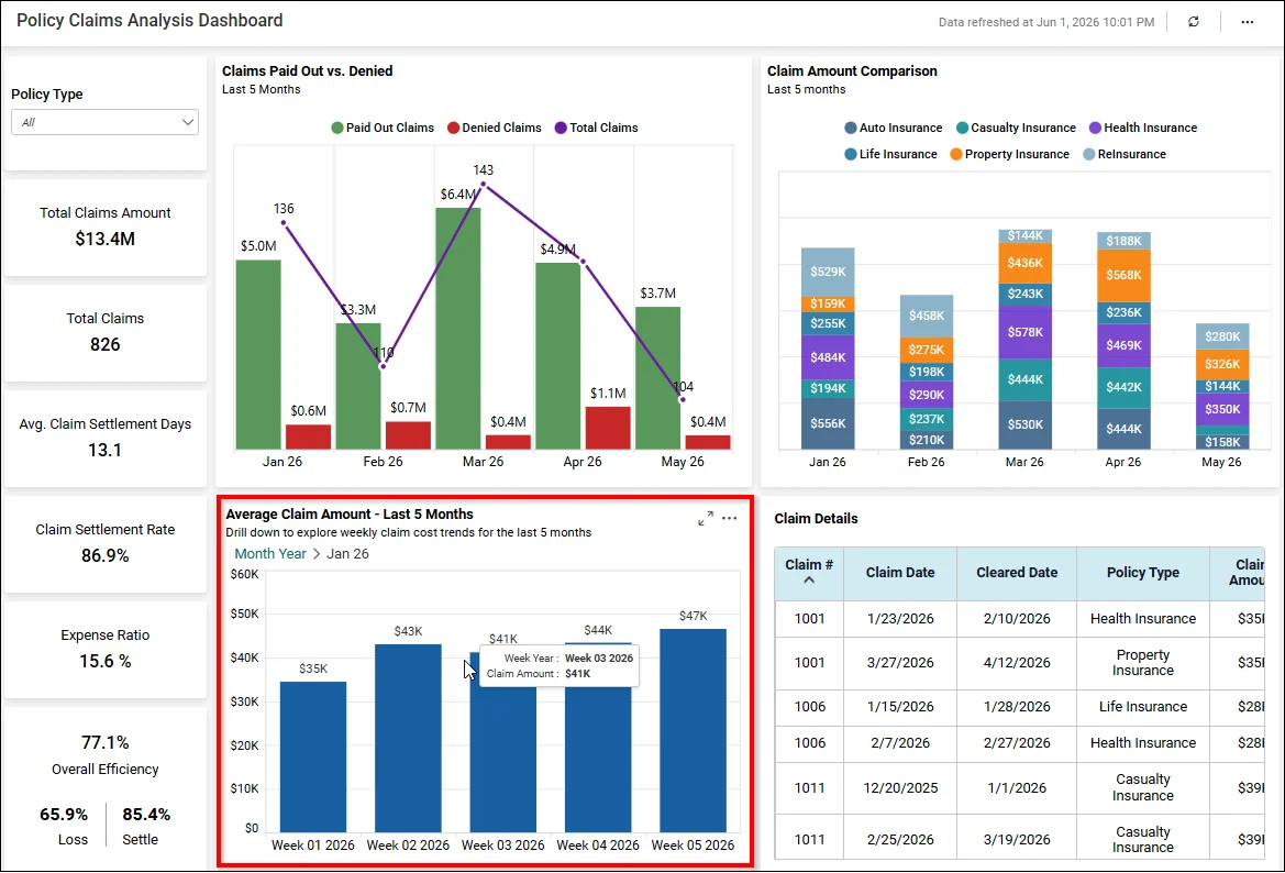
Policy Claims Analysis Dashboard
These use cases show how interactive dashboards support faster analysis across different business functions. Next, let’s see how Bold BI helps teams build and scale these dashboard experiences.
How Bold BI helps build interactive dashboards
Organizations often struggle to deliver interactive analytics because data is spread across multiple systems, dashboard development requires technical resources, and business users need self-service access without compromising security.
Bold BI® addresses these challenges by providing a unified platform for building, embedding, and scaling interactive dashboards across teams and applications.
Drag-and-drop dashboard designer: Business users can create dashboards quickly without coding, reducing dashboard development time and making analytics more accessible across teams.
AI-powered dashboard creation and insights: Users can ask questions, generate dashboards, summarize trends, and identify outliers faster, reducing the time spent manually exploring reports.
Data connectivity and preparation: Organizations can connect more than 140 data sources, unify scattered data, and prepare it visually, making it easier to create trusted dashboards from multiple business systems.
Dynamic filters and real-time data interaction: Users can personalize dashboard views, monitor live performance, and investigate changes in real-time rather than waiting for static reports.
Role-based security and personalization: Organizations can expand dashboard access securely by showing each user only the data relevant to their role, team, or customer account.
Custom branding and visual design: Businesses can deliver dashboards that match their brand, product experience, and user expectations, especially for embedded or customer-facing analytics.
Collaboration, sharing, and version control: Teams can securely share insights, work from the same trusted dashboard, and manage changes without losing earlier versions.
Ready to build interactive dashboards with your own data? Start your free trial and create your first dashboard in minutes, no credit card or complex setup required.


